Overview #
All three DnXT applications — Publisher, Reviewer, and Administrator — share a consistent interface layout. Once you learn the navigation patterns in one app, you can navigate them all. This guide covers the common interface elements you’ll see across the entire DnXT Suite.
Interface Layout #
The DnXT interface is divided into four main regions:
| Region | Location | Purpose |
|---|---|---|
| Header Bar | Top of screen | Logo, hamburger menu, app title, user menu, notifications, help |
| Left Sidebar | Left side | Main navigation menu with icons and labels for each module |
| Main Workspace | Center | Primary content area — dashboards, tables, TOC trees, document viewers |
| Bottom Panel | Bottom of screen | Expandable panel for My Account, search results, and detail views |
Header Bar #
The header bar spans the top of every page and contains:
Left Section #
- Hamburger Menu (three horizontal lines icon) — Opens the main dropdown menu with quick links to all modules
- DnXT Logo — Click to return to the Dashboard (home page)
- Application Name — Shows which app you’re in (Publisher, Reviewer, or Admin)
- Expand Arrow — Opens an additional menu with Help, About, My Account, and Logout options
Right Section #
- Sync History / Notifications (import icon) — Shows the status of any dossier sync operations (Publisher) or import operations (Reviewer). A blinking icon indicates an active operation. A badge number shows completed operations you haven’t viewed yet.
- User Greeting — Displays “Hello, [Your Name]“. Click to open the account dropdown with My Account and Logout options.
- Lightbulb Menu — Quick access to Help documentation and the About dialog (shows version number).
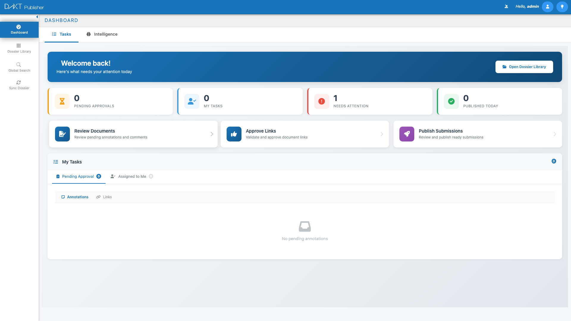
Left Sidebar Navigation #
The left sidebar is your primary way to navigate between modules. The available menu items depend on your application and permissions.
Publisher Sidebar #
| Menu Item | Icon | Description |
|---|---|---|
| Dashboard | Speedometer | Home page with statistics and recent activity |
| Dossier Library | Grid | Browse and manage all dossiers |
| Global Search | Magnifying glass | Search across all documents and metadata |
| Sync Dossier | Sync arrows | Synchronize dossiers with the Reviewer |
| Template Library | Spreadsheet | Manage submission templates |
Reviewer Sidebar #
| Menu Item | Description |
|---|---|
| Dashboard | Home page with import activity and statistics |
| Dossier Library | Browse imported dossiers |
| Import Dossier | Import new submissions from ZIP, folder, or repository |
| Repository | Manage the file storage structure |
Collapsing the Sidebar #
Click the arrow icon at the top of the left sidebar to collapse it. In collapsed mode, only icons are shown — hover over them to see tooltips. Click the arrow again to expand. You can also set the sidebar to always be collapsed in My Account > Settings > Hide labels for main menu.
Workspace Area #
The main workspace changes depending on which module you’re viewing. Common patterns include:
Dashboard View #
The default landing page shows statistics cards, charts (pie/donut charts for dossier status distribution), and interactive maps. Cards are clickable — clicking a statistic takes you directly to the relevant view with filters applied.
Library / Table View #
Modules like Dossier Library, Plan Library, and User Management display data in interactive tables with:
- Toolbar — Action buttons at the top (Create, Delete, Export, Refresh, etc.)
- Column Headers — Click to sort ascending/descending
- Search/Filter — Filter boxes above or below columns
- Row Selection — Click a row to select it; hold Ctrl to multi-select
- Pagination — Navigate between pages at the bottom of the table
- Export — Download table data as CSV
TOC Tree View #
The TOC (Table of Contents) editor in Publisher and Reviewer shows a hierarchical tree on the left and a document viewer/properties panel on the right. The tree supports:
- Expand/Collapse — Click the arrow next to a node to show or hide children
- Right-Click Context Menu — Right-click any node for available actions
- Drag and Drop — Move documents between TOC nodes (Publisher only)
- Color-Coded Icons — Different colors indicate document status and lifecycle state
Split-Panel Layout #
Some views (especially the TOC editor) use a resizable split-panel layout. You can drag the divider between the left tree and the right document viewer to adjust the proportions.
Common UI Elements #
Toolbars #
Most modules have a toolbar at the top of the workspace with action buttons. Common toolbar actions include:
- Create / Add — Opens a dialog to create a new item
- Delete — Removes the selected item(s) with a confirmation prompt
- Refresh — Reloads the current view’s data
- Export — Downloads data as CSV or generates a report
- Filter — Opens filter options to narrow down results
Alert Dialogs #
DnXT uses alert dialogs for confirmations, errors, and informational messages. These appear as modal overlays. Common types:
- Blue — Informational message
- Yellow/Orange — Warning that needs your attention
- Red — Error message
- Green — Success confirmation
Data Tables #
Tables throughout DnXT support:
- Sorting — Click any column header to sort. Click again to reverse.
- Column Resizing — Drag column borders to adjust width
- Row Selection — Single-click to select a row. The selected row is highlighted.
- Pagination — Tables with many rows are paginated. Use the controls at the bottom to navigate pages.
- Export to CSV — Click the Export button in the toolbar to download the table contents
Breadcrumbs #
When navigating into sub-views (e.g., opening a dossier from the library, then a submission), a breadcrumb trail appears below the header showing your navigation path. Click any breadcrumb to return to that level.
Keyboard Shortcuts #
| Shortcut | Action |
|---|---|
| Enter | Confirm login, submit search queries |
| Escape | Close dialogs and modal windows |
| Ctrl + Click | Multi-select items in tables and trees |
The Bottom Panel #
The bottom panel is a collapsible area that slides up from the bottom of the screen. It’s used for:
- My Account — Your profile and settings
- Search Results — Results from global search queries
- Detail Views — Additional details for selected items
Close the bottom panel by clicking the X button in its top-right corner. The main workspace returns to full height.
Session and Auto-Save #
DnXT sessions expire after 15 minutes of inactivity. If your session expires, you’ll be redirected to the login screen. The application preserves your last-viewed page in session storage, so when you log back in, you’ll return to where you left off.